01 · The Problem
A homepage that couldn't explain
what the product even did
The marketfeed homepage had accumulated design debt. The main site was dark-themed while other key pages — like the calculator — were light-themed, creating a fragmented, inconsistent experience. The layout was cluttered, the messaging vague, and the call-to-action buried.
Data told a clear story: low conversion on the workshop sign-up form, high bounce rate, and poor scroll depth. When we ran a usability test with 12 existing users, they struggled to articulate what marketfeed actually did within the first few seconds of landing on the page — a fundamental failure for a homepage.
Critically, 76% of our users were on mobile — yet the site was designed for desktop first and never properly adapted. On small screens, the hierarchy collapsed, the CTAs were hard to tap, and the content felt overwhelming.
The core problem: Users arrived with investment intent and left without signing up — not because the product wasn't right for them, but because the homepage failed to communicate its value in the first few seconds.
02 · My Role
Design lead across the
full project lifecycle
I led this project from initial audit to shipped product — owning the research, visual design, prototyping, and final handoff to engineering. The project was a collaborative decision between the data team and the design team, with me driving execution.
Competitive analysis & benchmarking
Information architecture redesign
Visual design & Figma prototyping (mobile-first)
3 rounds of iteration & user validation
Engineering handoff & micro-animation QA
Data Team (flagged conversion problem)
Product Manager
Engineering Team
Marketing Team
03 · Discovery & Research
Usability testing revealed a
clarity problem, not a content problem
I started with a structured usability test of the existing homepage with 12 users — a mix of current investors and first-time visitors. The task was simple: land on the page and tell me what marketfeed does and what you'd do next.
Most users couldn't confidently describe the product within 10 seconds. They pointed to three recurring issues: too much information presented at once, a dark visual theme that felt unfamiliar for a financial product, and CTAs that were easy to overlook. Several mobile users mentioned that the page felt "cramped" and hard to navigate with one thumb.
I followed this with a competitive analysis — benchmarking fintech peers and consumer apps known for strong onboarding clarity — to identify proven patterns for communicating product value in a single scroll.
Key research insight: Users weren't confused about whether to invest — they were confused about what marketfeed was offering them. The homepage needed to lead with a single, undeniable value proposition before asking for anything.
04 · Design Decisions
Six decisions that changed
how the page felt and converted
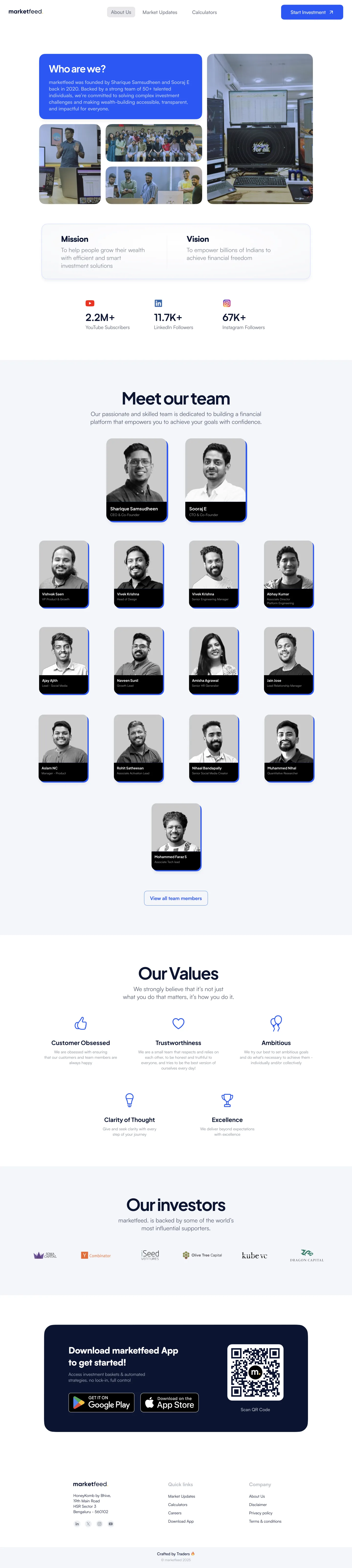
After auditing the old homepage, running competitive research, and sketching initial concepts, I moved into Figma and built a mobile-first prototype. Three rounds of iteration refined the design — each round informed by user testing and internal debate with the product and marketing teams.
Desktop — Full Homepage
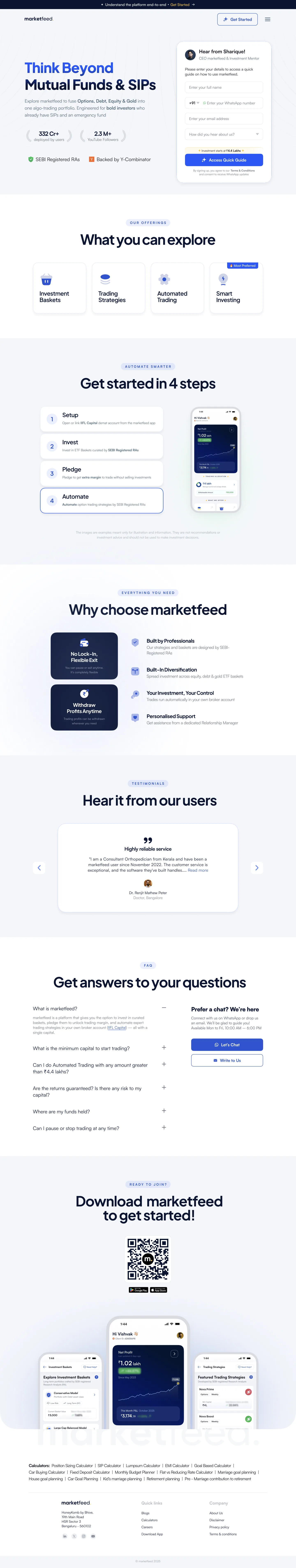
Desktop — About Us Page
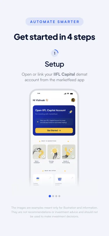
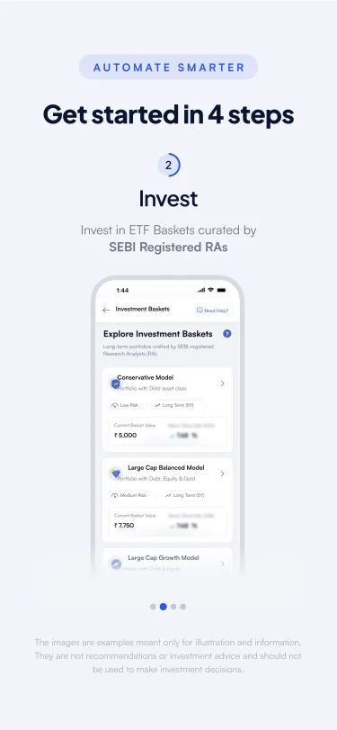
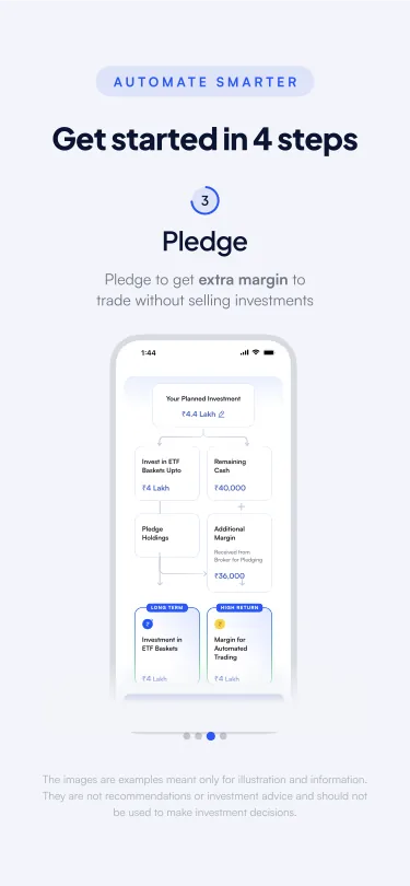
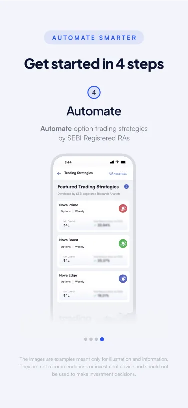
Mobile — Full Page Scroll

Mobile-first, built at 375px. Every section designed for one-thumb navigation — content stacks cleanly, CTAs stay within reach, and the visual hierarchy drives the eye downward without overwhelming the user.
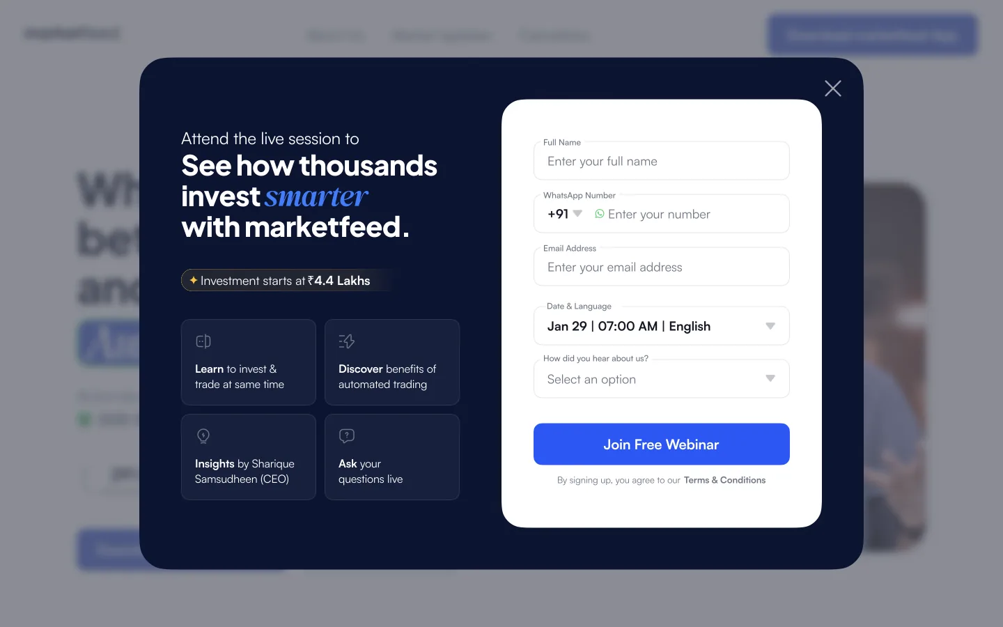
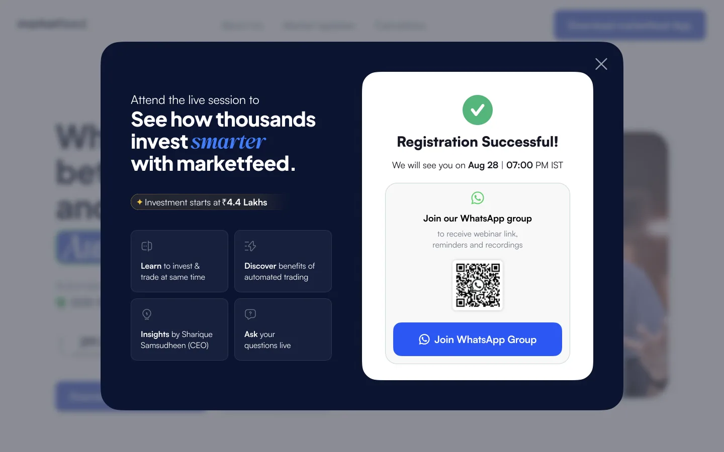
Interactive Flow — Step by Step
Interaction Detail — Modal Flow
05 · Before vs. After
Every element revisited,
nothing kept by default
06 · Outcomes
A homepage that finally
worked as an acquisition channel
The redesign shipped after 2 months and 3 rounds of iteration. The results validated the core hypotheses from user research — clearer messaging and a mobile-first layout made the page more effective at converting first-time visitors.
07 · Learnings